Book covers : Travel novels
- Stacy Henin
- 15 oct. 2018
- 2 min de lecture
In third year of communication studies at University we had to create 3 book covers about a theme we could choose. With my partner, Lucie Comolet, we decided to create three covers about travel books. Here are the four covers we created :


Command : " The Bldp editions, new on the market, are looking forward a visual identity for some collections : thrillers, sentimental, Sci-fi, historic and travel books. They ask for a declination of 1st and 4th cover for three different books"
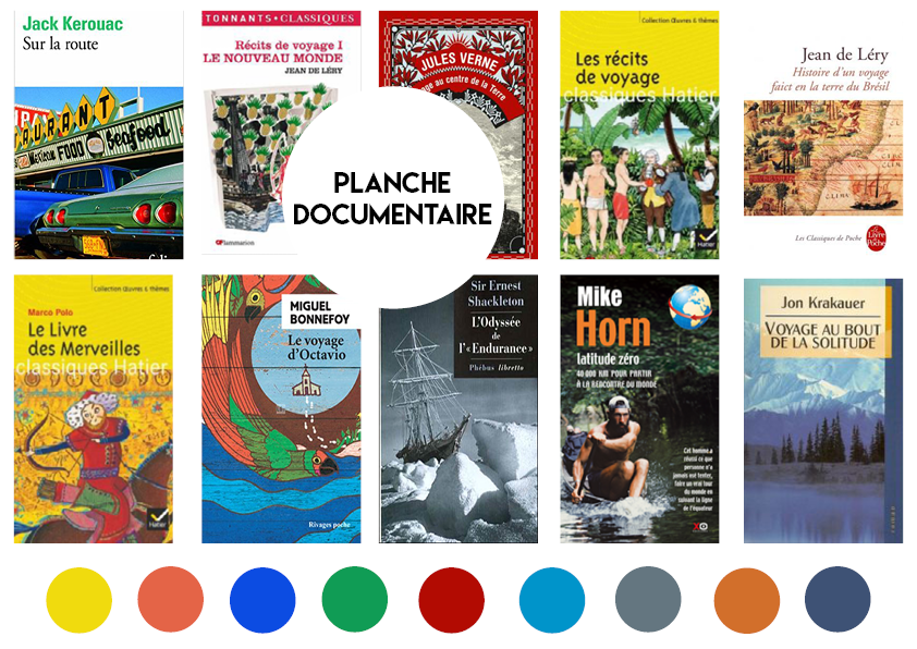
1. Market study
Concerning the world of edition in France, we figured out that, after wandering in libraries and book shops, the Travel Novel section is almost inexistent. We could find them in big book shops like FNAC or Sauramps but not in small neighbourhood librairies. And we also noticed that these novels weren't graphically remarkable. We decided to draw our inspiration from anglo-saxons editions which are usually more creative and illustrated.
When we studied travel novels covers in france we noticed that they were often tacky : too many details, old illustrations, too many colors. Far from what we tended to create. Here is a market study board we created to understand the trend in France considering travel novels :
2. Creative Axis
After our market study, our creative axis imposed himself as being "give back the will to read travel novels". Our way of succeeding : creating a modern and minimalist book cover and wondering about the ways to make this book the cheapest possible.
Like I said previously, we drew our inspiration from anglo-saxons editions. And decided to create a mood board about what we wanted our books to look like :

3. Pre-project / sketches


4. Justification of graphic choices
Colors : Each cover is illustrated with different color ranges to permit the reader to recognize each edition. For "Souvenirs du Cambodge" we were inspired by the cover of the jungle book. We wanted to use complementary colors and give a "pop" atmosphere. For "Voyage au bout de la solitude" which is the translation of the novel "Into the wild", we wanted to use cold colors to remind the color of alaskian forests. For "objectif mars" we just wanted to use the real colors of the sky (dark blue) and mars (magenta/red).
Typography : we wanted a font easy to read, simple but with a modern touch. We didn't want a serif font like it's too usual in travel novels. We finally chose "Lemon Milk" font, that we really loved because it has the particalarity to be really adaptable on all sizes.
The layout : the layout is really simple. We just put the main illustration created for each book, with the same triangle and logos. The triangle is unique to the collection, and will make it recognizable.


Commentaires